

Droppath 6.0: Our Path to Liquid-Glass
- Authors

- Pierre-Luc Beaudoin
- pierre-luc@suzero.tech
- pierre-luc@suzero.tech
With the release of iOS 26, Apple introduced Liquid Glass, a major evolution in the platform’s user interface aesthetics and design language. This advancement goes beyond visual refreshes of core UI components such as buttons and toolbars; it redefines foundational interface paradigms, requiring developers to critically adapt their applications. Here, we outline our approach and the engineering considerations undertaken in migrating Droppath Route Planner to the Liquid Glass interface standard.
Our initial response to Liquid Glass was shaped by prior experiences with sweeping Apple design transitions, notably the iOS 7 overhaul. At that time, fundamental changes to system UI defaults introduced significant regressions and instability, demanding extensive intervention to restore prior behaviors. In contrast, Apple’s implementation for Liquid Glass offers a controlled opt-in migration pathway (see the documentation for UIDesignRequiresCompatibility), greatly reducing risk. Our preliminary integrations with Xcode 26 have surfaced only minor alignment inconsistencies: specifically, one dialog’s title misplacement. Thankfully, we didn’t have to make an urgent release with Xcode 26, but it was reassuring to have this option at the ready should it be needed.
Looking for Examples #
A foundational aspect of any design migration is the availability of reference points in Apple’s own ecosystem. First-party applications provided essential guidance on best practices and interaction models. For instance, when evaluating presentation strategies for user profiles and settings, we were inspired by the Music app. Similarly, for search interface refinements, we compared approaches in Music, Mail, and Files; ultimately, Files’ design language aligned best with our UX objectives, particularly regarding the placement of search results relative to the search field. Having results above the search bar is just not natural enough for us.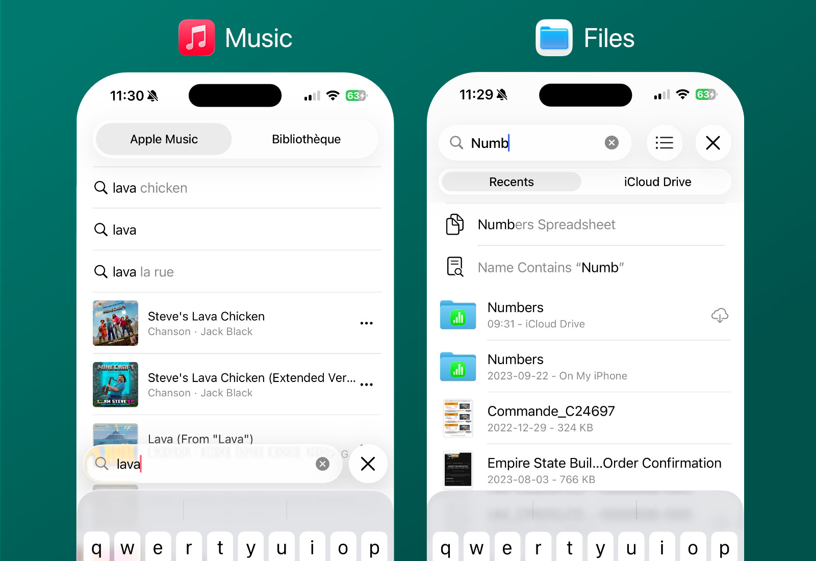
The End of Colored Navigation Bars #
The legacy colored navigation bar, a hallmark of earlier UI paradigms, proved incompatible with the new Liquid Glass look. The vibrant backgrounds resulted in excessive contrast and visual disharmony against Liquid Glass’s translucent buttons. Our solution was to transition to a white navigation bar, which delivered consistency with the new tab bar gradient, unifying the app’s overall visual look.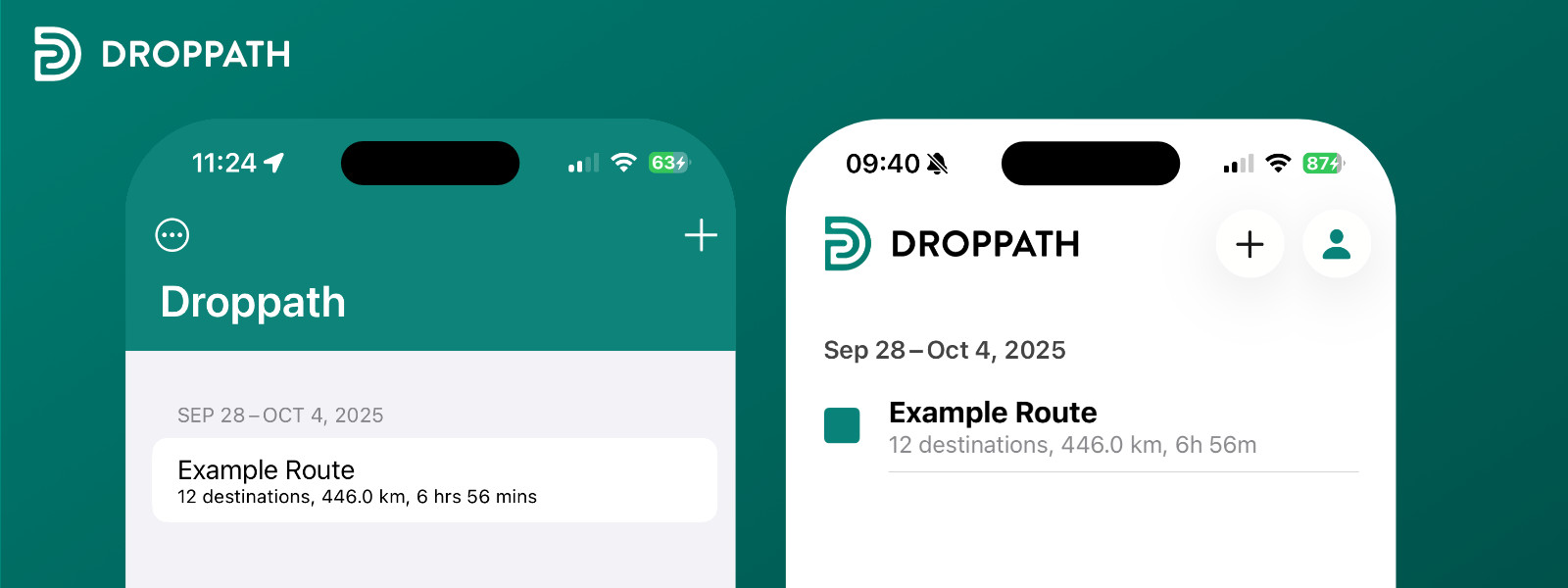
Rethinking Action Placement #
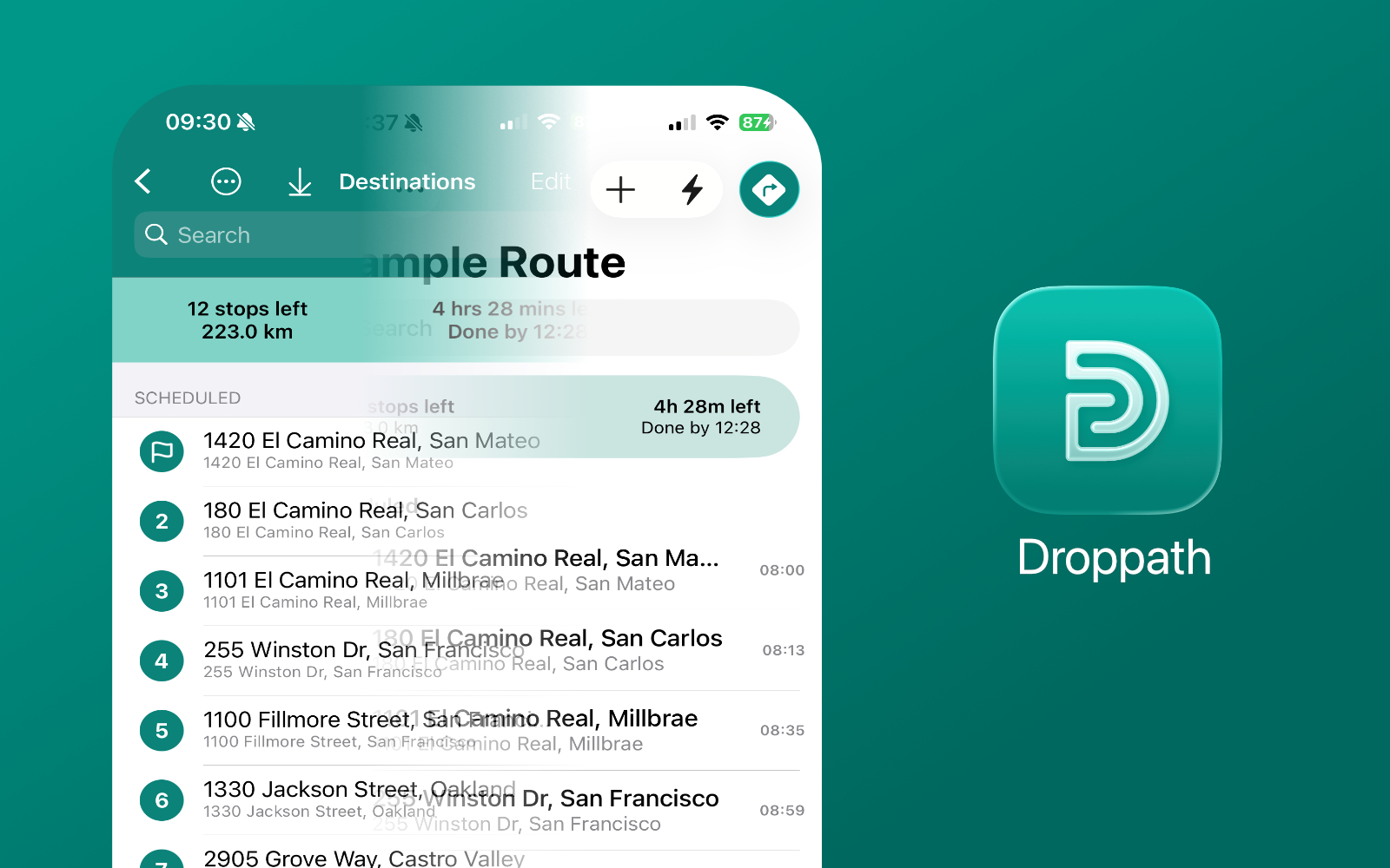
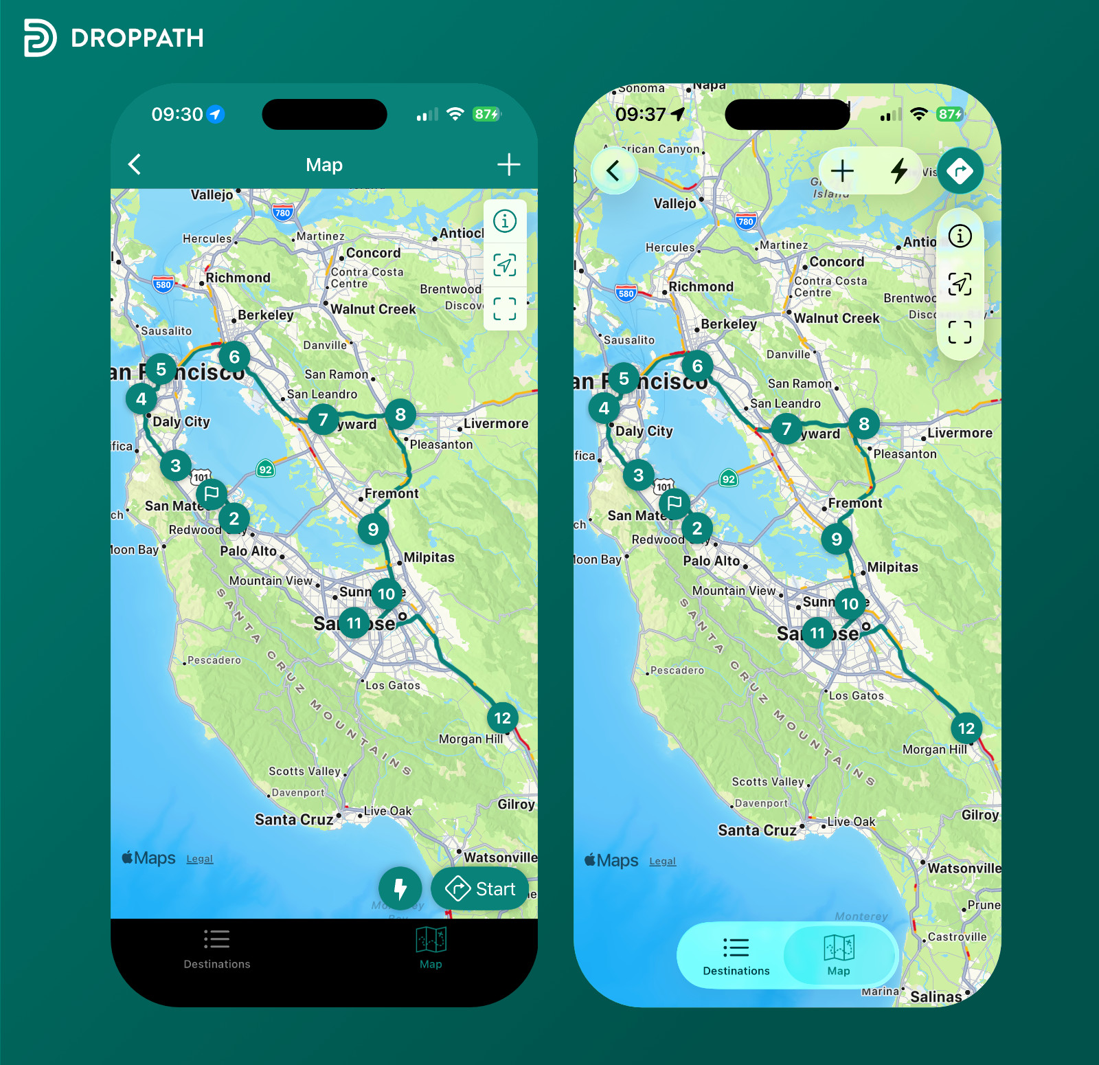
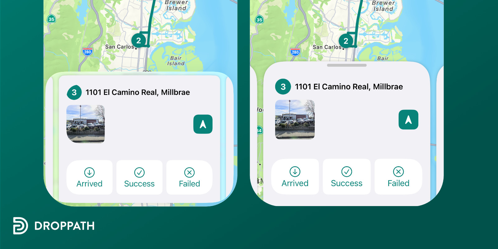
Liquid Glass reimagines tab bars, reducing their footprint at the screen’s lower edge and allowing for more visible content. This shift prompted us to revisit the Material Design elements, specifically Floating Action Buttons (FABs), that we had adopted. Previously positioned for prominence, FABs appeared incongruous next to the revised, slimmer tab bar. The new design guidelines, however, allow for prominent action buttons within the navigation bar itself. Droppath now centralizes key actions in this area, grouping actions to maintain sense and accessibility.
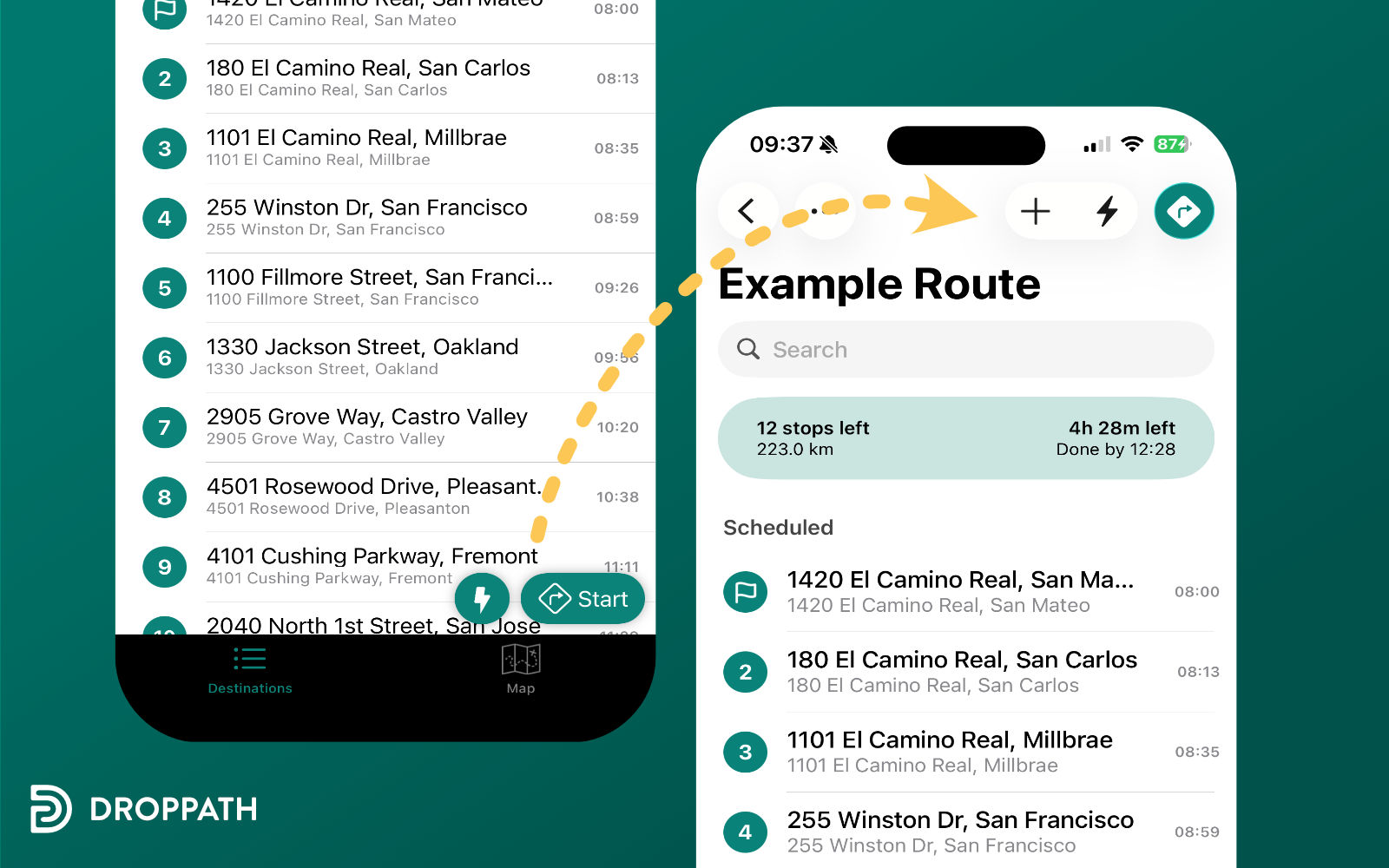
In the map view, repositioning the buttons to the top right allowed us to organize them neatly alongside the map actions. Their more prominent appearance makes it obvious what your next step should be.
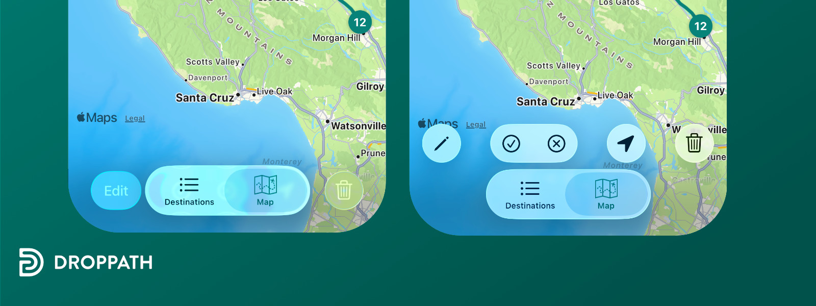
Missing UI Pattern: View Mode Switching #
A complex aspect of Droppath’s interface has been the dual use of tabs: both as mode switchers (list versus map views) and as navigation for pinned folders (local versus cloud-synced routes). While the folder navigation justifiably fits the tab model, the use of tabs for view mode selection departs from established iOS conventions. On Android, this toggle is handled with a navbar button, but this limits discoverability. In contrast, iOS tab bars at the bottom of the screen function as effective, accessible segmented selectors for our context.
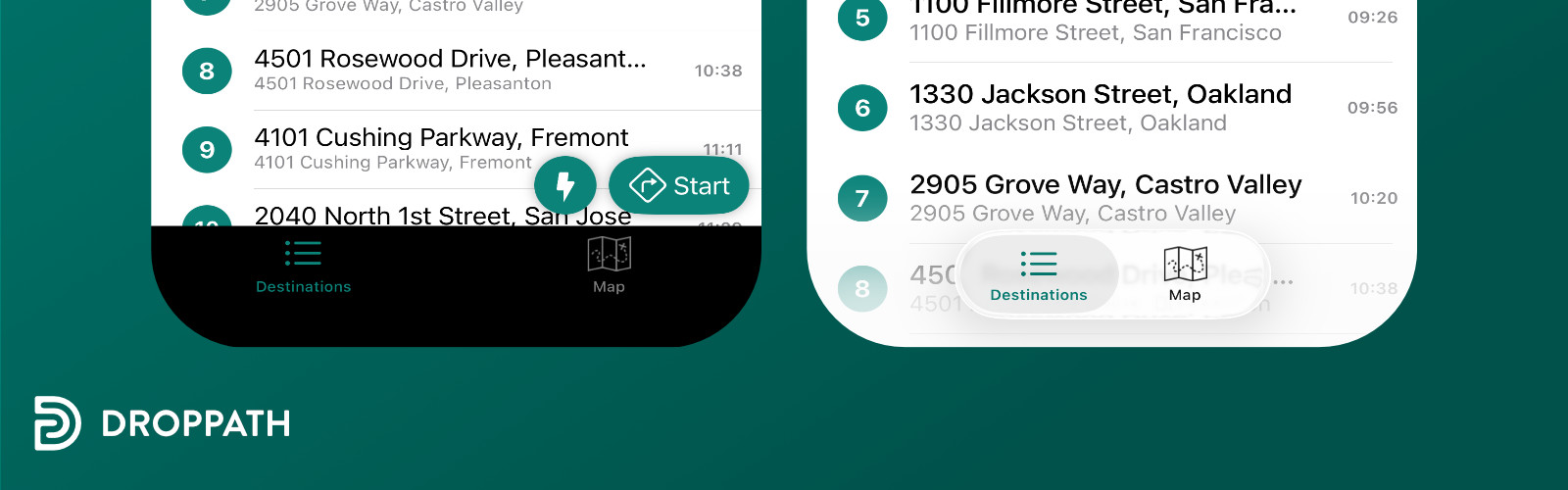
Analyzing Apple’s Photos and Files apps, we observed varying methodologies. Photos employs a centrally placed toggle, whereas Files relegates view switching to a menu under the ellipsis, trading discoverability for menu simplicity. Our user data strongly require frequent toggling between map and list modes, leading us to maintain the segmented tab approach despite its atypical use, as minimizing disruption during major UI transitions remains a top priority.
Secondary Content Relocation #
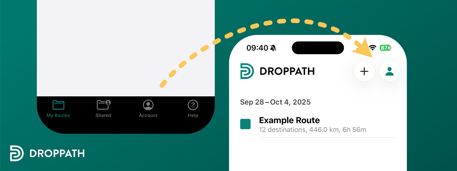
To maintain semantic clarity in our tab structure, we have shifted the Account and Help screens to the top-right corner, mirroring the organization found in Apple’s Music app. After all, users rarely have to access their account’s settings, so why provide immediate access through the tab bar? While Droppath currently lacks user-uploaded profile images, the SF Symbol is a recognizable placeholder icon—that we were already using elsewhere—will have to do.
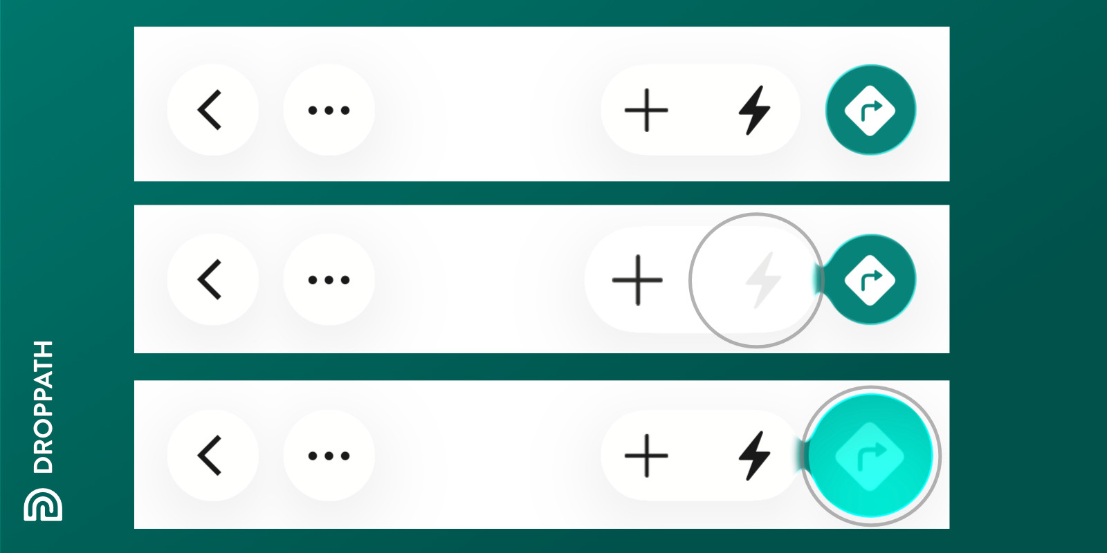
The UI Feels Alive and Responsive #
The introduction of Liquid Glass brought a new level of responsiveness and liveliness to interface controls. Buttons that had not been updated for Liquid Glass immediately stood out—they appeared static and unengaging compared to their revitalized counterparts.
Even the tab bar buttons now gently expand and merge as users tap them, further enhancing the sense of fluid interaction characteristic of Liquid Glass.

Code Challenges #
SwiftUI Integration #
Implementing support for Liquid Glass in our SwiftUI components brought a unique set of challenges. To prevent duplicating logic across multiple #available(iOS 26.0, *) code paths, we consolidated version checks and encapsulated style changes in helper methods like glassProminentStyleIfPossible(). Even so, we still counted about 20 separate availability conditions throughout the codebase—a necessary layer to maintain backwards compatibility while adhering to new visual requirements. With any luck, we won’t face another sweeping UI transition of this scale for many years.
Sheet Presentation #
Our Driving screen relies on system sheets, but their appearance was awful under Liquid Glass. The custom swipe gestures we support—enabling left/right transitions between stops within a sheet—are not behaviors natively supported by iOS sheets. As a result, adapting our drive sheets for the new design demanded extra engineering effort to restore the intended navigation flow. Make sure you try all of your app’s functionality before shipping.
Navigation Controller Toolbar #
Getting our navigation controller’s toolbar to align visually with Liquid Glass proved trickier than expected. The default toolbar placement was under the tab bar, so we introduced a custom toolbar, positioning and styling it to ensure correct placement.
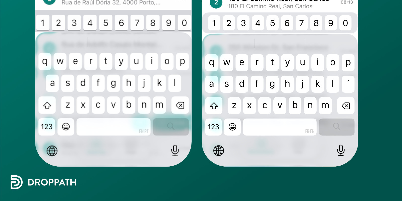
Enhanced Input Accessory #
Many Droppath users regularly enter both numbers and letters, so we include a numeric input accessory above the keyboard for convenience. This custom row is built from a locally maintained copy of YZKeyboardAccessoryInput—a niche library first written in 2015 and now nearly impossible to find online. As part of this release, we refreshed its appearance: subtle rounding and updated visual cues help it harmonize with the new interface.
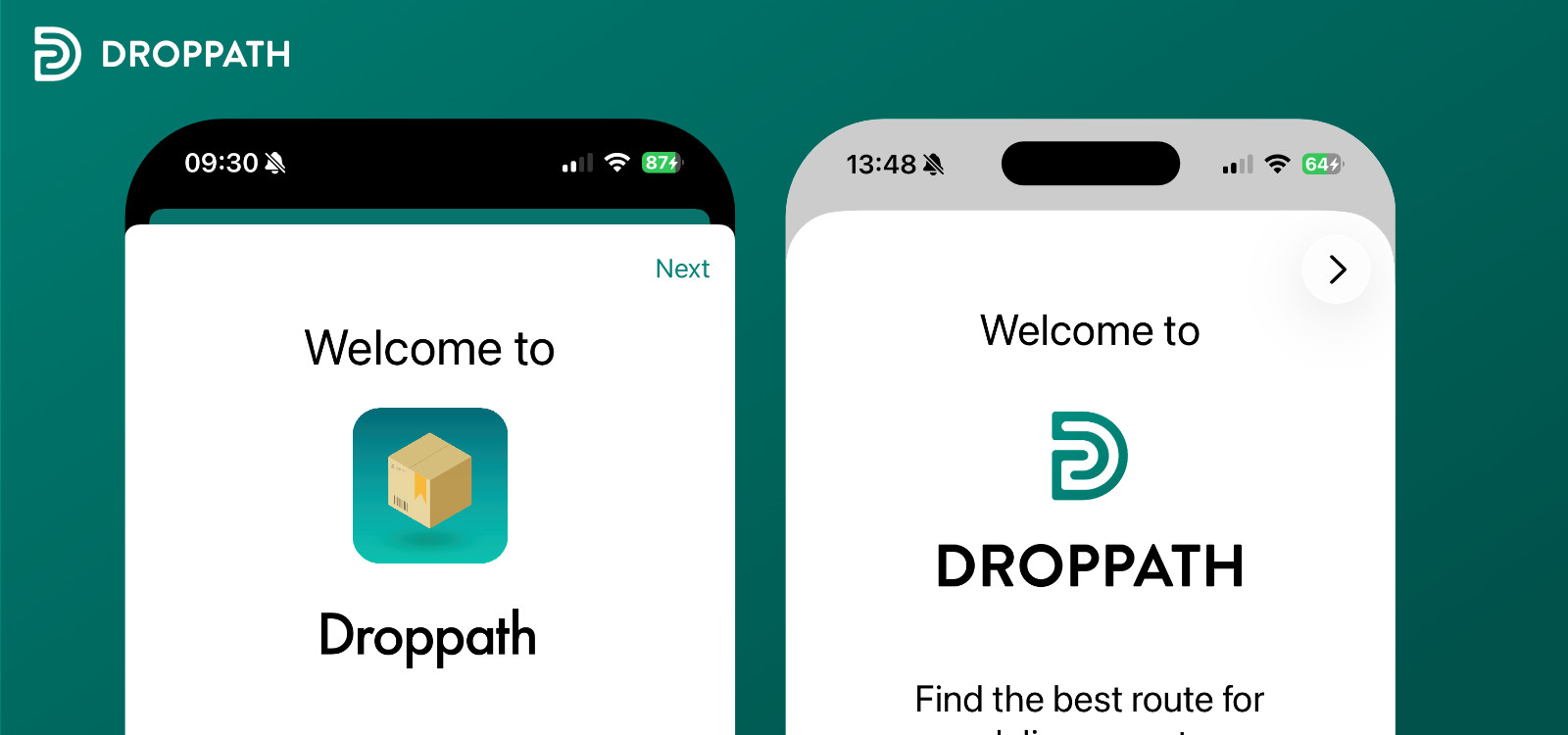
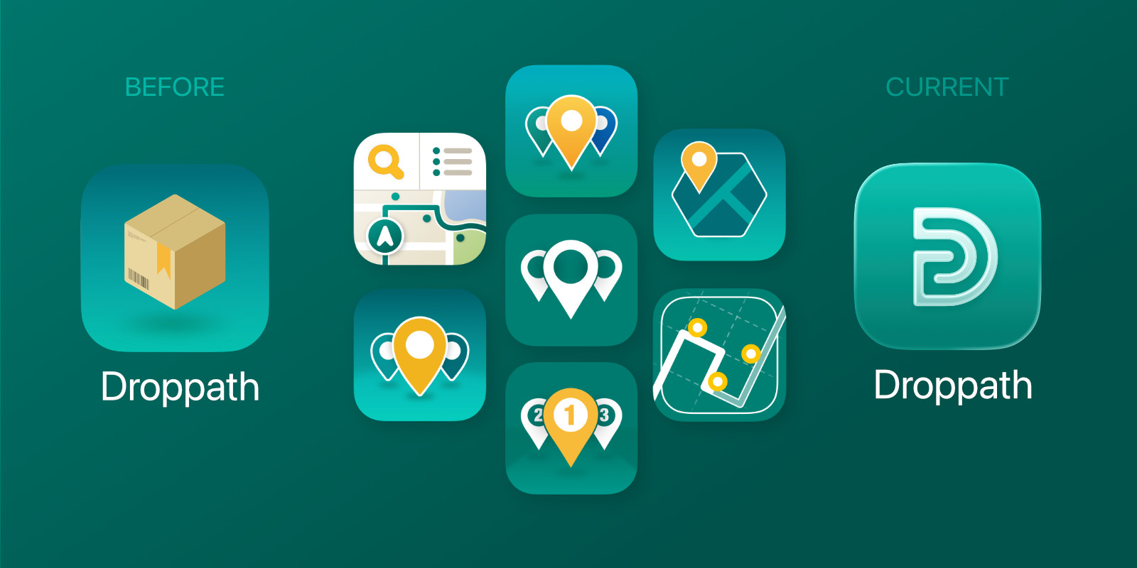
A New, More Versatile Icon #
Throughout the past year, we explored multiple icon concepts, seeking clarity and flexibility beyond traditional box imagery common to delivery apps. Our new icon—abstracting a path into the form of a capital “D”—offers immediate brand recognition while accommodating Droppath’s broader use cases beyond delivery. The single-color scheme ensures enhanced reproducibility across digital platforms and future swag.
Leveraging the Icon Composer tool, we adapted the new visual identity to embrace the Liquid Glass aesthetic. Although the icon does not exploit the full complexity of layered glass effects, it harmonizes with the new design ecosystem and fits out among peer applications embracing Liquid Glass.
In summary, the migration to Liquid Glass in Droppath Route Planner 6.0 represents a comprehensive modernization to align with iOS 26’s design standards. We are confident this update not only elevates the user experience but also highlights Droppath’s care for its users. Adopting Droppath should be natural for any iOS 26 user.
Droppath Route Planner 6.0 will be available soon for iOS 26.
 Download for iOS
 Download for Android